Your recruitment website is often the first place candidates and clients engage with your brand. Think of it as your shop window: if it’s run-down and disorganised would you buy with confidence?
The way you choose to present your brand and services plays a crucial role in how you come across to clients and candidates: starting with the look and feel of your website.
If you’ve spent any amount of time strengthening your agency’s brand, you need a slick looking website to match. A good recruitment website will encapsulate your story and help you do what you do best – recruit. So what makes a good recruitment website design?
What makes a good recruitment website design?
While everybody wants different things from their recruitment website design, here are five things that are essential for great design and functionality...
- Modern design - If your website looks even a little bit outdated it is more likely to make a bad impression on clients and candidates than convert them (especially Millennials and G-Zen!).
- Seamless integration with your CRM – Your CRM and website shouldn’t work in silos, by bringing them together you'll pull in a constantly stream of candidates and be able to supercharge your recruitment activities.
- Clear navigation and CTAs – A well-thought-out navigation makes it really clear to candidates how they should move through your website and to your CTAs. It can also help show which parts of your site are built specifically to cater for clients or candidates.
- Tailor-able features – In today’s world, you don’t need to settle for a basic website template. Good website designs come with plenty of plug-ins so you can supe up your website with a blog, extra domains and pages whenever you need them.
- The ability to manage everything yourself – Gone are the days of waiting for your web designer to update your website copy. A modern design will give you complete control over your website content fields (including key SEO attributes) so you can edit and evolve your website along with the market.
Here are seven recruitment website designs available exclusively to Firefish...
1. Barracuda
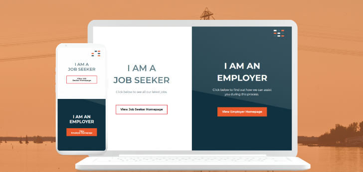
2. Angel Fish
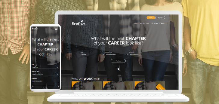
3. Mahi Mahi
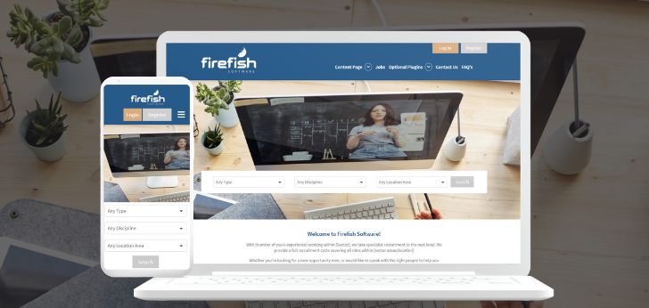
4. Coral
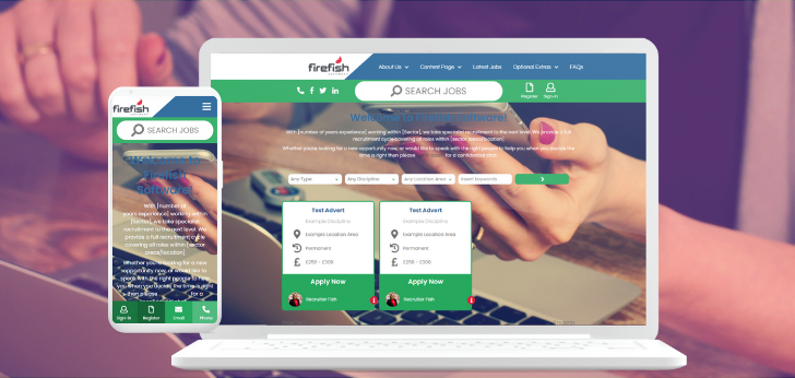
5. Barfish
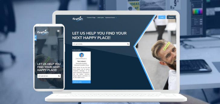
6. Blow Fish
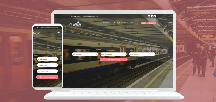
7. Shark
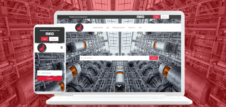
Browse the full collection of recruitment website templates available for Firefish customers. Like what you see? They why not book a demo.
Andrew Watson
As Product Marketing Executive Andrew shows off all the Firefish features that help change the way you recruit. Keep an eye on our news page and social channels to see what's new with Firefish each month!


