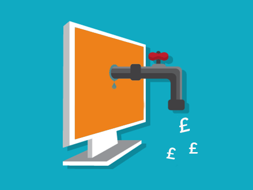
Adaptive or responsive – what’s best for your business? As a recruiter, do you know how many potential new clients or candidates access your website from a mobile device? Well done if you do, and if you don't then it might be time to find out!
 The new buzzword around search and the Internet seems to be “mobile” so I wanted to help recruiters understand why it’s important to have a mobile site and most of all the difference between adaptive and responsive websites.
With a near 50/50 split of candidates searching for jobs using a mobile device versus a desktop, it’s time to step back and review just how good your candidate journey really is using a mobile device.
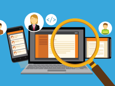
Adaptive and responsive websites are both mobile ready; they just present the content from your recruitment website slightly differently – in a more mobile friendly view.
Responsive Websites
Designers would say a responsive website gives users the best viewing experience. Images and text simply and smoothly resize to fit the device being used, so visually it looks great on a desktop, tablet and mobile phone. The webpage is fluid and just keeps resizing depending on the viewing space (you can test this on a normal web browser by simply re-sizing the screen size).
Adaptive Websites
An adaptive website is when the actual website layout changes dependent on the device, so there may be up to 3 main fixed template layout designs for a desktop, tablet or mobile device. The designs all sit in the background and when someone visits the site, the site can detect the type of device you are using and then presents the layout to suit the screen size. Unlike responsive websites, changing a browser size after the content has loaded will not change the layout as the template is detected when the page is first opened.
Mobile Site (aka not Responsive or Adaptive)
If the prospect of investing in a fully responsive website seems daunting then a mobile site may be a good choice. A mobile site delivers what is essentially a smaller and easier to navigate version of your website. Not only will this give your candidates a better journey when checking out your website, but having a mobile version of your website will help with search results too.

Unsure how many visits to your website or jobs pages are from a mobile? Check out our blog on setting up Google Analytics for recruiters, once set up you will be able to see the results for yourself.
What’s best?
Some would argue adaptive websites are better from a speed performance view, however from user experience responsive wins over and over. My personal choice would be a responsive website, however it really depends on what your users are doing on your mobile site (Responsive is also Google’s recommended design pattern)
Search engines, Google in particular, have announced major changes in how they will present results in mobile search – not sure if your site is mobile friendly – test it using Google’s free mobile checker tool.

So from a recruiter’s perspective – it’s time to go mobile!
In association with Indeed, Social Talent released an informative infographic on mobile usage in the jobs sector. The article on mobile job search is worth a further read if you are still debating with yourself about mobile in recruitment.

source: Social Talent