Your recruitment website is your greatest tool for brand building, advertising roles and converting candidates into your CRM. But only if you get it right!
Before it can increase application rates, you need to make sure your website functions seamlessly, creating candidate journeys that make talent want to return, time and time again.
But how do you get your website to that place? While it is important to look the part, don’t be tempted to sacrifice functionality for good design. We’ve put together a list of attributes that will get you the most returns from your recruitment website:
1. Stand-out branding and design
Your recruitment website is essentially a giant billboard for you, your services and your brand. If it looks and sounds the same as every other recruitment website out there, how can you expect to make an impression on prospects and candidates?
Creating a strong and memorable brand is a key ingredient in ensuring your recruitment website's success. Everything from the design of your logo to your website copy should be brand and memorable.
2. A great recruitment blog
Posting great content on your website is crucial for bagging returning visitors, providing content for your email marketing and improving your SEO so candidates and clients can find you online.
Educational content that provides solutions to your candidates' or clients' challenges and makes their lives easier is key. You want to provide a whole array of different content as well and provide lots of 'open doors' for them to subscribe for more content, such as sales brochures, videos, webinars, crowdcasts or podcasts.
Updating your content frequently and consistently will also encourage return visits to your site. And when you do add new content, don’t forget to promote it on your social networks.
3. A strong SEO strategy
After all your hard work, you’ll want your recruitment website to get found online by the right audiences.
Make sure you’ve covered all the bases of all your onsite SEO elements such as Titles, H1 Headers, and Meta descriptions after doing a substantial amount of keyword research to find out what words your visitors are using to search on (I’d recommend the Google keyword tool).
Grade your website: Recruitment Website Grader
4. A simplified user journey
Ensuring your website design has a simple user journey is crucial if you want to drive candidates to take the relevant actions during their job search. So what can you do to create a seamless user journey?
First, keep your navigation bar as simple as possible so users can easily move around your website. Without any roadblocks to stop them, they'll stick around on your website for longer and be more likely to convert into your CRM.
Once you’ve established the main ‘calls to action’ (job application, newsletter subscription, eBook download) on your site use your navigation to channel your users through to each.
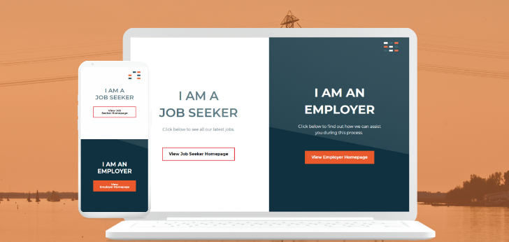
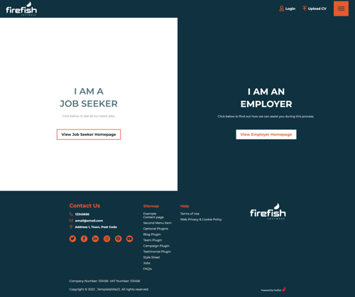
And for recruitment agencies, a well thought-out navigation also allows you to make it really obvious which parts of your site are for clients and which parts are for candidates. Here's a Firefish website template as an example.
5. Job pages that are Google for Jobs-optimised
Ranking in Google for Jobs doesn't happen by accident: you have to add the right data to ensure your ads pull through and appear in relevant search. The good news is, good recruitment software optimises job ads as standard.
6. Complete control
Just as your brand needs evolve with the market, so does your website. Ultimately, the last thing you want when you need to make quick changes to your website is to waste time asking third-party web developers to tweak every last detail.
To avoid this, choose a recruitment website that is easy to customise and update from the CMS. That way you have complete control over your content and can react to change and customise the face of your brand in real-time. 
Amy McLaughlin
As Senior Digital Marketer at Firefish, Amy keeps our Firefish customers up to date with the latest news from the Aquarium.


